The colour you choose for any room or space is a very personal decision. There are so many to choose from and sometimes colours that you like may not translate once painted on. This can leave you despondent and can be costly if you have to re-paint a room a number of times in order to get the scheme to work.
But help is at hand in this post we will take you through some principles for using a colour palette effectively and also what to consider when choosing a colour.
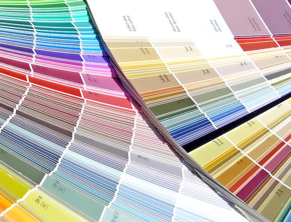
How colours work
There are 3 types of colour, primary, secondary and tertiary. Primary colours are fixed and cannot be created.
Secondary colours are made of two primary colours mixed equally. Tertiary colours are made of different primary and secondary colours mixed together in different percentages.
This is the foundation of a colour palette and where the selection process begins.
Building blocks of a colour scheme
When choosing a colour scheme it is important to note that there are four types of colour schemes each with their own distinctive traits.
Monochromatic
This uses different tones of the same colour along with black or white to darken or lighten the room.
Analogous
Uses colours that are next to each other on the colour wheel.
Contrast
As the name suggests it is more dynamic with many different contracting colours.
Complementary
Using two opposing colours creating a bold space.
Things to ask yourself
Choosing the colour itself may not be the only thing to consider, we suggest asking yourself 3 simple questions
1) What room is it
2) How much light does it get (natural and fixtures)
3) Is it a communal space or a private room
Bringing it all together
So if you are beginning the process of choosing colour your decision process may work something like this:
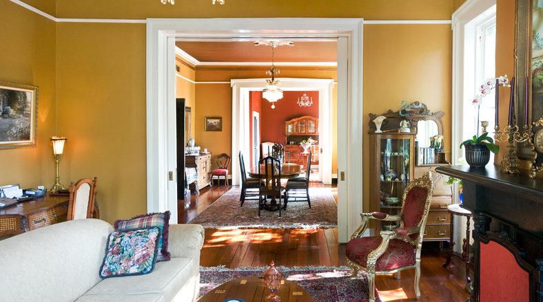
1) I would like to use a primary colour and yellow is one of my favourites
2) I really like the idea behind of a Monochromatic scheme, so I’ll play with shades of yellow against white
3) The space is communal, has a lot of light and is a open plan living room
After playing around with different colours you might end up with something like this pic which use a mustard tone (darker side of yellow) against white to bring out the light.
If you need advice or assistance with interior design, building or maintenance why not let Pancare assist! you can visit our contact page or check our details below.
The opinions expressed in this article are guidelines only. All spaces are different and before embarking on any renovation an assessment of the space should be done.